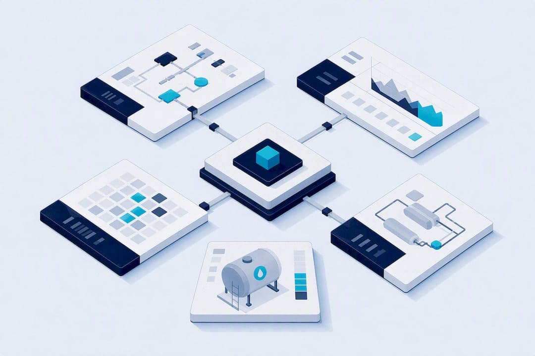
The most useful SCADA dashboard examples fall into five recurring types: water treatment tank monitors, manufacturing OEE dashboards, plant health and alarm consoles, KPI operator overviews, and drill-down HMI screens. Each relies on the same visual toolkit: status cards, historical trend charts, alarm banners, gauges and symbol widgets. Study a demo or template in each category before you design anything new, and treat a no-code platform as a shortcut once you know which pattern fits your process.
TL;DR:
- Most effective SCADA dashboards follow five key types: tank monitors, manufacturing OEE, plant health, KPIs, and alarm consoles, each using common visual tools.
- Designing dashboards with minimal animation, muted backgrounds, and alarm color prioritization improves clarity and operator response times.
- Protocol choices like OPC UA, Modbus, and MQTT depend on existing plant infrastructure, with data binding to a single source of truth for accuracy.
- No-code platforms enable rapid, drag-and-drop creation of industry-specific dashboards, often using AI-assisted scene generation and ready-made assets.
- Custom role-based views and optimized update frequencies are essential to balance performance, user needs, and data accuracy across different plant operators and managers.
Table of Contents
- SCADA dashboard examples worth studying first
- Design patterns and visual rules for effective SCADA dashboards
- Implementation notes: data binding, protocols and alarm flows
- How a no-code 3D SCADA platform realises these examples
- How SCADA dashboards differ across industries
- Customising dashboards for different user roles
- Performance and optimisation for SCADA dashboards
- Author perspective: prioritise clarity over polish
- See the examples running: Kingfisher demos and marketplace
- FAQ
SCADA dashboard examples worth studying first
Every industrial site ends up needing some version of these five screens. Rather than designing from scratch, pull apart what already works and adapt it.
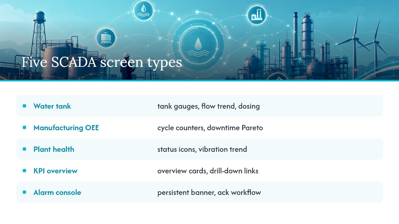
Water treatment tank monitor. These dashboards centre on tank level gauges, flow meters and dosing controls, usually arranged so an operator can see the whole process train at a glance. Widgets typically include a vertical fill gauge per tank, a flow rate trend chart, and a dosing pump status card with an on/off toggle guarded by confirmation. The interaction pattern is simple: click a tank to drill into its historical trend and alarm history. This layout suits any continuous-process plant where a handful of vessels need constant visibility, not just water utilities.
Manufacturing OEE dashboard. These favour cycle time counters, downtime Pareto charts and throughput trend lines stacked above a live line-status strip. Clicking a downtime bar usually opens a popup with the fault code and duration, which is the drill-down pattern floor managers actually use during a shift. It fits any discrete manufacturing line where the question is always "why did we lose the last twenty minutes."
Hydroelectric or plant health monitor. Health dashboards lean on device status icons (green, amber, red), SCADA uptime counters and vibration or temperature trend charts. Multi-state symbol widgets change colour and icon depending on equipment condition, a pattern ThingsBoard's SCADA documentation implements through SVG-based symbols and absolute-position layouts. This suits any asset-heavy operation, from turbines to compressor stations, where condition monitoring matters more than throughput.
KPI overview and operator HMI. These combine overview cards (total output, active alarms, current mode) with drill-down links into equipment-level screens. A production-ready SCADA dashboard template built on Next.js and Chart.js demonstrates this structure directly, with real-time updates and equipment status tracking that the authors say can be adapted to a new process in a few days.
Alarm console. A dedicated alarm screen needs a persistent banner, filterable severity lists and an acknowledgement workflow. The Mini SCADA HMI zero-build demo is worth opening specifically for this, since it runs offline in a browser and includes runbooks and commissioning checklists alongside its alarm management.
Design patterns and visual rules for effective SCADA dashboards
The High-Performance HMI approach, built on ISA-101 principles, is the closest thing this industry has to a style guide. The core idea is restraint: a neutral grey background, minimal animation, and colour reserved almost exclusively for alarm states. The GoJS High-Performance HMI operator screen sample shows this in practice, keeping the base palette deliberately dull so that red and amber alarm indicators actually stand out when they appear.
Two structural patterns recur across good examples. The overview-to-detail pattern puts a summarised, low-density screen in front of operators by default, with drill-downs available but not forced. Multi-state dashboards use symbol widgets that change appearance based on live tag values, so a single pump icon can represent running, stopped, faulted or offline without needing four separate widgets.
A quick checklist for adapting any example you find:
- Do use grey or muted backgrounds; don't default to bright corporate colour schemes.
- Do reserve red and amber strictly for active alarms; don't use them decoratively.
- Do keep animation minimal; don't add moving graphics that compete with genuine alarm conditions.
- Do limit each screen to the widgets an operator needs for one decision; don't cram every available tag onto one view.
Pro Tip: Before you finalise any dashboard layout, put it in front of the operators who'll actually run it, on the tablet or panel they'll actually use. A design that reads clearly on a 27 inch monitor in an office can be unreadable on a dusty ten inch panel at 2am, and that gap only shows up in on-device testing.
Implementation notes: data binding, protocols and alarm flows
Most SCADA dashboards wire into one of three protocol families, and the choice usually comes down to what's already on the plant floor:
- OPC UA suits process plants with existing DCS or PLC infrastructure, since it handles complex data structures and security natively.
- Modbus remains the default for older PLCs and simpler field devices where OPC UA support doesn't exist.
- MQTT fits IoT gateways and distributed sensor networks, particularly where bandwidth or connectivity is inconsistent.
The binding pattern that keeps dashboards trustworthy is a single source-of-truth tag model, where every widget reads from the same node ID or MQTT topic rather than a locally cached copy. Sample SCADA projects consistently show this pattern because it stops the overview screen and the detail screen from ever disagreeing about a value. Data quality flags (GOOD, BAD, UNCERTAIN) should travel with each tag so an operator can tell a stale reading from a live one.
Alarm handling needs defined severity tiers, a clear acknowledgement mechanic, and retention for trend and audit purposes. Publish/subscribe or WebSocket connections give far more responsive updates than polling, and that responsiveness matters most on alarm banners, where a delay of even a few seconds changes how an operator reacts. Browser-based deployment with containerised back ends is now the common shape for new builds, largely because it avoids the installed-client overhead that older SCADA systems carried.
How a no-code 3D SCADA platform realises these examples
Every pattern above still has to be built, and that's usually where projects stall. Some no-code 3D SCADA platforms allow engineers to drag components from marketplaces of ready-made 3D and 2D industrial assets and connect them to live data through built-in drivers for common industrial protocols such as OPC UA, Modbus, BACnet and Siemens S7.
AI-assisted scene generation can turn an existing schematic or site photo into a starting layout, which shortens the path from blank canvas to a working overview screen. An example implementation is a digital twin management platform built for an international airport, where the same overview-to-detail logic described earlier: terminal status, equipment health, drill-down alarms, was rendered as an interactive 3D environment rather than a flat 2D screen.
Worth exploring directly:
- The component marketplace for a sense of what's available out of the box.
- Published case studies for outcomes beyond the airport example.
How SCADA dashboards differ across industries
The five example types above cover most of what a reader will encounter, but the emphasis shifts noticeably by sector. Oil and gas dashboards weight heavily toward safety interlocks and gas detection alarms, often with a dedicated shutdown status panel that takes visual priority over everything else on screen. Food and beverage dashboards lean on batch tracking and recipe management, since traceability and changeover time matter more than continuous throughput in many lines.
Utility-scale power dashboards, by contrast, tend to prioritise grid stability metrics, frequency and voltage trends, over the equipment-level detail a factory floor needs. Building automation and HVAC dashboards, meanwhile, often collapse dozens of zones into a single floor-plan view with colour-coded temperature overlays, a spatial layout that manufacturing dashboards rarely use because a factory line is linear rather than a floor plan.
What stays constant across all of these is the underlying grammar: overview screens for situational awareness, drill-downs for investigation, and a dedicated alarm view for anything time-critical. The widgets change; the hierarchy doesn't. That's the real reason studying a water treatment example still helps someone designing for a power substation. The pattern transfers even when the tags, thresholds and iconography don't.
Customising dashboards for different user roles
A dashboard built for a plant manager and a dashboard built for a control room operator should rarely look identical, even when they're pulling from the same tags. Operators need dense, alarm-forward screens with fast access to acknowledgement controls, because their job is reacting within seconds. Managers need summarised KPI cards, shift comparisons and trend charts, because their job is reviewing patterns over days or weeks, not reacting to a single spike.
Access levels should follow the same split. Give operators write access to acknowledge alarms and adjust setpoints within defined limits, but restrict configuration changes, alarm threshold edits, and historical data exports to engineering or supervisory accounts. Maintenance technicians typically need a middle layer: read access to equipment health and vibration trends, plus write access to log service events, without the ability to touch process setpoints at all.
Role-based views also help with cognitive load. An operator staring at forty tags they don't need to act on will miss the one they do. Build a lean default view per role, and let drill-downs carry the extra detail rather than putting everything on the landing screen. This is one area where a no-code platform earns its keep, since duplicating a dashboard for a new role and hiding or exposing widgets takes minutes rather than a rebuild.
Performance and optimisation for SCADA dashboards
Update cadence is the first place performance problems show up. Polling every tag on a one-second interval sounds thorough, but it floods the network and the browser with updates the operator doesn't need, especially on tags that change slowly, like tank temperature. Reserve fast update rates for genuinely time-critical values and let slower-changing telemetry refresh less often.
Trend chart history is the second common bottleneck. Rendering months of raw historical data in a browser chart will lag on anything but a workstation-grade machine, so most well-built dashboards aggregate older data into hourly or daily averages and only keep high-resolution data for a recent rolling window. Alarm retention for audit purposes can stay in a database without needing to load into the live chart at all.
Widget count matters more than most designers expect. A screen with sixty live-bound symbol widgets, each re-rendering on every tag update, will noticeably lag compared to a screen with fifteen. Grouping tags logically and paginating or tabbing between equipment groups keeps individual screens light. Browser-based platforms that use WebSockets for live updates generally outperform polling-based architectures here, since only changed values push through rather than the whole dataset refreshing on a timer.
Author perspective: prioritise clarity over polish
Borrow the alarm banner and overview pattern before you touch 3D visuals or fancy motion. Every dashboard failure I've seen traced back to visual noise burying the one number that mattered, not a lack of features. Test on the operator's actual device before you ship, and resist adding drill-downs until the basics are bulletproof.
— Jeffrey Anastacia
See the examples running: Kingfisher demos and marketplace
Reading about symbol widgets and alarm banners only gets you so far. Some modern no-code 3D SCADA platforms let users build water tank monitors, OEE dashboards, or plant health consoles without scripting, by dragging assets from marketplaces of industrial components and binding them to common industrial protocol data. This drag-and-drop and AI-assisted approach can significantly reduce build times compared to scripted 2D SCADA development.
If any of the gallery patterns above matches a project on your desk, the fastest way to judge fit is to look at the real thing. Browse the product landing page for live demos, or head straight to the component marketplace to see what's already built for your industry, then request a trial or quote to test it against your own tags.
FAQ
What are some examples of SCADA systems?
Common SCADA dashboard examples include water treatment tank monitors, manufacturing OEE dashboards, hydroelectric or plant health monitors, and alarm consoles, each built from status cards, trend charts and drill-down widgets.
What does a SCADA dashboard actually look like?
A typical SCADA dashboard uses a muted grey background with status cards, gauges and trend charts, reserving bright colours strictly for active alarms, following the High-Performance HMI approach.
What is the most popular SCADA system?
There's no single dominant SCADA product; adoption varies heavily by industry and installed hardware. No-code platforms like Kingfisher 3D SCADA are gaining traction where teams want faster, script-free dashboard builds.
What is a dashboard, with an example?
A dashboard is a single screen summarising live data through widgets like gauges and charts. A water treatment tank monitor showing live tank level, flow rate and dosing status is a practical example.